Most B2B sites spend months on design and then lose the visitor at the last step: a long, vague form that nobody wants to fill in. The traffic is there, the interest is there, and the inquiry never arrives. A website contact form is a small part of the page, but it decides whether the visit turns into a conversation. This guide collects contact form best practices from published usability and conversion articles: which fields to ask for, what the button should say, how to handle consent and spam, and what to check after launch. Figures below are quoted from the named sources as examples, not as market rules.
Website contact form: what it must do and what it must not replace
A good website contact form has one job: make the first message cheap for the visitor and useful for your sales team. It is not a gate and not a questionnaire. The Nielsen Norman Group ran a usability study of corporate sites and concluded that a contact page needs a phone number and an email address, not only a form. Treat the form as one channel among others. Decide first who reads the inbox.
Contact form design: how many fields and which ones
Every extra field costs you some visitors, so start from the minimum: name, work email and a free-text message. Published guides usually name three to five fields for a first contact. Add a field only if it passes three tests. You need it to answer. It helps you route the request. The visitor can fill it without looking anything up. A company name can stay optional on a B2B site. A tax number or a budget range in the first message usually does more harm than good. Where you do need qualification, Red Evolution describes a two-step form: the first screen asks for the contact details, the second asks about the project, and it cites a published case where this raised qualified leads. Read such results as an example to test, not as a promise.
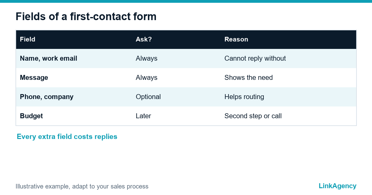
| Field | Ask it? | Reason |
|---|---|---|
| Name and work email | Always | You cannot reply without them |
| Message | Always | Shows the real need |
| Phone | Optional | Some buyers prefer a call, some do not share a number |
| Company | Optional | Helps routing on a B2B site |
| Budget | Later | Better in the second step or the first call |
Labels, helper text and a button that says what happens next
Put the label above each field and keep one column. Mark required fields clearly and write the error next to the field, in plain words, instead of a generic red banner. The Telerik guide on form design stresses helper text and real-time error indicators and warns against using colour alone to show a mistake. Good contact form design also means a clear button. Replace the default “Submit” with a verb that matches the offer, for example “Send request” or “Book a call”, and add one line under it: who will answer and when. NN/g reports that business users expect a reply within a day, so promise only what your team can keep.
What to write under the button
State your working hours too. One sentence is enough: “We reply within one working day.” If you cannot promise that, write the real time.
Phone, messenger and chat next to the form
Many buyers will not fill in any form. They want to call, write in a messenger or see an address. A visitor who prefers a call should find the contact form and the phone number together. Add a messenger or chat only if someone answers it during working hours. NN/g found that hiding a phone number frustrates users and costs trust. If your contact page is part of a wider rebuild, our website redesign services cover the page structure, the form and the places where visitors expect to find them.
- Show phone and email in the header or footer of every page.
- Put the form on the contact page and on each service page.
- Offer one messenger, and only if someone replies.
- State working hours next to every channel.

Mobile and accessibility: forms that work with a thumb and a keyboard
Check the contact form design on a phone before you check it anywhere else. Fields must be large enough to tap, the right keyboard must open for email and phone, and the button must not hide behind the browser bar. For accessibility, every field needs a visible label, the form must work with the keyboard alone, and errors must be readable without colour.
Consent and spam protection without punishing real people
If you collect personal data, tell people why and link to the privacy policy next to the button. For visitors from the EU and the UK, a consent checkbox should be unchecked by default, because pre-ticked boxes are not valid consent under GDPR. Ask your lawyer to confirm the wording for your case. Good spam protection starts with invisible measures: a honeypot field that humans never see, rate limits and server-side checks. The Big Red Jelly guide names a honeypot and Google reCAPTCHA v3, and other guides advise limiting visible CAPTCHA puzzles, because they slow real users down. Add a visible challenge only if spam keeps getting through.
After the click: thank-you page, routing and delivery test
The work does not end when the visitor presses the button. Spam protection and delivery matter as much as the layout. Build the thank-you page as part of the form: it should repeat what happens next, send a short confirmation email and route the request to a person, not to a shared mailbox that nobody opens. Then test delivery: submit the form yourself every month, from a phone and a laptop, and check that the message arrives and does not land in spam. A form that silently fails is worse than no form. If requests must go straight into your CRM and notify the right manager, our business process automation work connects the form to the tools your team already uses.
Website contact form: free consultation on your inquiry form
We will review your form, the fields, the button text, consent and delivery, and tell you what to change first. If the page needs a rebuild, our web development services can take it on.
- review of the form and the thank-you step;
- list of fixes ordered by effect.
Send a request and we will reply within one working day with a free consultation plan.

Frequently Asked Questions (FAQ)
How many fields should a website contact form have?
Published guides usually suggest three to five for a first contact: name, work email, message and, if needed, phone or company. Add a field only if you need it to reply or to route the request.
What should the contact form button say?
Use a verb that matches the offer, such as “Send request” or “Book a call”, instead of a bare “Submit”. Add one line under it that says who will reply and when.
Should a contact form replace a phone number?
No. Usability research from the Nielsen Norman Group says a contact page needs a phone number and an email address, with the form as an extra channel.
Do I need a consent checkbox on the form?
If you collect personal data from the EU or the UK, show a clear notice and an unchecked consent box where consent is the legal basis. Ask your lawyer to confirm the wording for your case.
How do I stop spam without a CAPTCHA?
Start with a honeypot field, rate limits and server-side checks, and consider an invisible check such as reCAPTCHA v3. Add a visible puzzle only if spam still gets through.
How often should I test that the form delivers messages?
Submit it yourself every month from a phone and a laptop, and check that the message arrives in the right inbox and not in spam. Test again after every site or mail change.
How can LinkAgency help with my contact form?
Send a request with the page address. We run a free consultation, review the fields, text, consent and delivery, and give you a list of fixes in order of effect.