A visitor arrives with one task, meets a menu built from your org chart and leaves for a competitor. The best practices for website navigation come down to one idea: the menu mirrors what the visitor came to do, not how your company is organised. Below you get a method, a table of labels, a rule for depth, a one-day card sort and a five-person test. Most guides I read come from vendors and agencies, so I name them and treat their numbers as their own estimates.
Best practices for website navigation: why the client gets lost
Companies draw a structure from the inside: departments, product lines, the history of the site. Visitors think in tasks such as price, proof and contact. When the two differ, the client makes one wrong click and goes back to search. Three causes repeat. Labels are written in company language. One menu serves every audience. Old pages were never removed. Count the clicks that your best customer needs for three tasks today.
Website structure: start from visitor tasks
List what visitors want to do, then group the pages. Take real questions from sales calls and support mail. Write each as a short verb phrase: see prices, check a case, book a call. Put the tasks that bring money first. A page nobody asked about can live in the footer. A website structure planned this way gives you a clean page list and a first draft of the information architecture. For a rebuild, our website redesign services start from this task list, before any wireframe exists.
Site navigation: how many items and how to name them
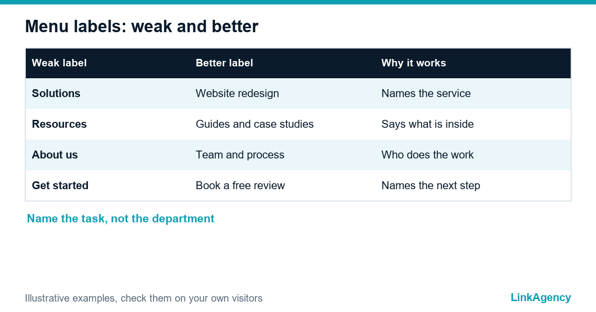
Mailchimp suggests four to seven items in the main menu, and Orbit Media says a longer list should be grouped. Both give the number as practical advice, not as a measured law. Orbit also argues for descriptive labels over clever ones. Website navigation design starts with words, not colours. Site navigation with plain labels is easier to scan and to index. The table shows how a vague label becomes a clear one.
| Weak label | Better label | Why it works |
|---|---|---|
| Solutions | Website redesign | Names the service people search for |
| Resources | Guides and case studies | Says what is inside |
| About us | Team and process | Answers who does the work |
| Get started | Book a free review | Names the next step |
Run three checks on every label:
- a stranger can say what is behind it without clicking;
- it does not repeat another label in the same menu;
- it uses the words customers use, not internal product names.
Mega menu or simple dropdown
A mega menu suits a large catalogue, not a ten-page company site. A plain dropdown with five or six links is enough for most service businesses, and a mega menu is hard to use with a thumb on a small screen, so keep it for the desktop version only.
The three clicks rule and service pages
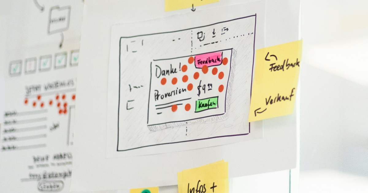
Three clicks from the home page is a guideline that many guides repeat, with little research behind it. What matters is that each click feels like progress and that the visitor always knows where they are in the website structure. A visitor who sees clear labels will click four times without complaint, while one who is guessing gives up after two. Keep service pages one level below the main menu. Orbit Media recommends a call to action in the header, so the contact route sits on the same path. Our web development services page follows this pattern. Website navigation best practices for depth are simple: short lists, plain names, no dead ends.
Mobile menu, breadcrumbs and search
On a phone the mobile menu hides behind a hamburger icon, so the order of items matters more. Put the most wanted task first and make the phone number tappable. UserWay, an accessibility vendor, lists descriptive link text and colour contrast among its navigation practices. Practices differ between a phone and a desktop, but website owners rarely adapt the navigation. Breadcrumbs show the path on deep pages. Internal search helps when the site has more pages than a menu can carry. Best practices for website navigation on a phone mean short lists and large targets, and good website navigation design tests the menu with a thumb, not a mouse.
SEO and internal links: how website navigation feeds search
Menu links are internal links on every page, so they show search engines which pages matter, and a short menu keeps that signal clean instead of spreading it over thirty items. Descriptive labels give those links context. Plan the sitemap before a redesign, because moved pages need redirects. Our checklist on redesign without losing rankings covers that step. Our SEO services include a review of the hierarchy and the footer links. A best practice for website navigation is to treat design and SEO as one job.
Card sorting in a day
Card sorting is the cheapest way to check a navigation plan, and one day is enough for a small site of ten to thirty pages.
- Write every page and topic on its own card.
- Ask five to eight customers or colleagues to group the cards without help.
- Ask each person to name every group in their own words. Website navigation best practices need this proof.
- Compare the groups. Where people disagree, the label is unclear.
- Draft the menu from the agreed groups.
Test the structure on five people
Give each person one task, such as finding a price, and do not help. This is tree testing in its simplest form. Note where they hesitate and which wrong click comes first. Five people prove nothing statistically, yet repeated stumbles show what to fix. Change the top two problems, then test again with new people. A website navigation design that passes both tests is rarely wrong. Add analytics later, for example menu clicks, to see whether real visitors behave the same way, and repeat the test after every change to the website structure.
Best practices for website navigation: free site-structure review
We look at your menu and page structure and show where visitors get lost. We can also quote website redesign services after the review, with no obligation.
- a map of your top visitor tasks and the clicks they take;
- a draft menu and a list of labels to change.
Send a request and we will reply within one working day.

Frequently Asked Questions (FAQ)
How many items should a main menu have?
Mailchimp and Orbit Media suggest four to seven items and grouping when the list grows. Treat it as practical advice, not a law: every label must be clear and the order must follow visitor tasks.
Is the three clicks rule still true?
It is a guideline, not a measured limit. A visitor follows more clicks when each label is clear and every step feels like progress, and gives up fast when guessing, whatever the website structure looks like on paper.
Should the menu be the same on mobile?
The items should match, but order matters more on a phone because the menu hides behind an icon. Put the most wanted task first, make the phone number tappable and skip the mega menu.
How do I test a menu without a big budget?
Run a one-day card sort with five to eight people, then give five people one task each and watch where they hesitate. Fix the two biggest problems and test again.
Does site navigation affect SEO?
Menu links are internal links on every page, so they show search engines which pages matter. Plan the sitemap before a redesign, because moved pages need redirects.
How does LinkAgency help with site structure?
Send us your site and we review the menu, the click paths and the internal links, then suggest a draft menu and a label list. The review is free and comes with a short plan.